21 Results of Genomic Analysis
⬜ Developing Hypotheses
⬜ Sample Collection
⬜ Outbreak Investigation
⬜ Sequencing
⬜ Bioinformatics
🟩 Molecular Epidemiology
⬜ Public Health Implementation
Line list of cases likely linked to outbreak
| Sample ID | Collection Date | Notes |
|---|---|---|
| Bat_Trainer_01 | 2031-01-13 | Worked with the muubats; attended conference |
| Bat_Trainer_02 | 2031-01-13 | Worked with the muubats; attended conference |
| Canine_Trainer_01 | 2031-02-01 | Works closely with workers 01 & 02; interacted with bat trainer 01; works with canines |
| Duck_Trainer_01 | 2031-02-04 | Works closely with worker 06; works with ducks |
| Duck_Trainer_02 | 2031-02-05 | Works closely with worker 06; works with ducks |
| Duck_Trainer_03 | 2031-02-06 | Works closely with duck trainers and works with ducks |
| Feline_Trainer_01 | 2031-01-21 | Married to bat trainer 02; works closely with the felines |
| Resident_01 | 2031-02-10 | Exposed to resident 03 that visited the Safari Park Canine areas |
| Resident_02 | 2031-02-10 | Exposed to resident 03 that visited the Safari Park Canine areas |
| Resident_03 | 2031-02-11 | Visited the Safari Park Canine areas |
| Resident_04 | 2031-02-11 | Exposed to resident 03 that visited the Safari Park Canine areas |
| Resident_05 | 2031-02-13 | Visited the Safari Park, interacted with workers and animals |
| Resident_06 | 2031-02-13 | Could not reach |
| Resident_07 | 2031-02-13 | Could not reach |
| Resident_08 | 2031-02-13 | Visited the Safari Park, interacted with workers and animals |
| Resident_09 | 2031-02-13 | Could not reach |
| Worker_01 | 2031-01-22 | Works closely with bat trainer 01 and canine trainer 01 |
| Worker_02 | 2031-01-22 | Works closely with bat trainer 01 and canine trainer 01 |
| Worker_03 | 2031-01-20 | Works with the bat trainers |
| Worker_04 | 2031-01-19 | Works with the bat trainers |
| Worker_05 | 2031-01-20 | Works with the bat trainers |
| Worker_06 | 2031-02-08 | Works with the duck trainers |
| Worker_07 | 2031-02-09 | Works with the duck trainers and the ducks |
Line list of cases in outbreak. The line list shows the sample IDs of the sequenced cases in the outbreak. The second column shows the collection date of the samples collected from the case in year-month-day format. The third column shows the exposure notes collected from the case interviews conducted during the outbreak investigation. Unfortunately some of the cases, such as the residents, could not be reached. Some information remains incomplete for the workers as some workers tend to work in different areas, and are involved in different responsibilities when it comes to taking care of the animals and the park.
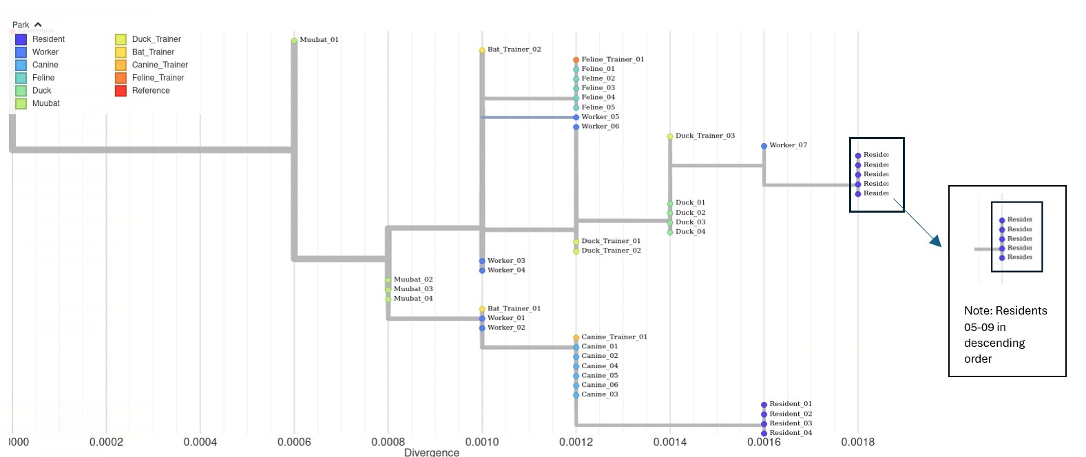
Open tree in new tab for full view
Phylogenetic Tree of Outbreak. This phylogenetic tree shows the evolutionary relationships between sequences from the outbreak. The tips on the tree represent individual genome sequences of the virus, which are color-coded by species in relation to the park. The x-axis represents divergence (also sometimes referred to as genetic distance, or the number of mutations from the reference genome). To give an example, the reference genome is 5000 bases long, so a divergence of 0.0006 would mean 3 mutations difference. (5000 * 0.0006).
Note that identical sequences like muubat_02, muubat_03, and muubat_04 lie on the same x-axis and are stacked vertically. Comparing the muubat sequences with the sequences of the residents, the branch length of the resident is much longer indicating that the viruses that infected the muubats are less closely related to the residents.
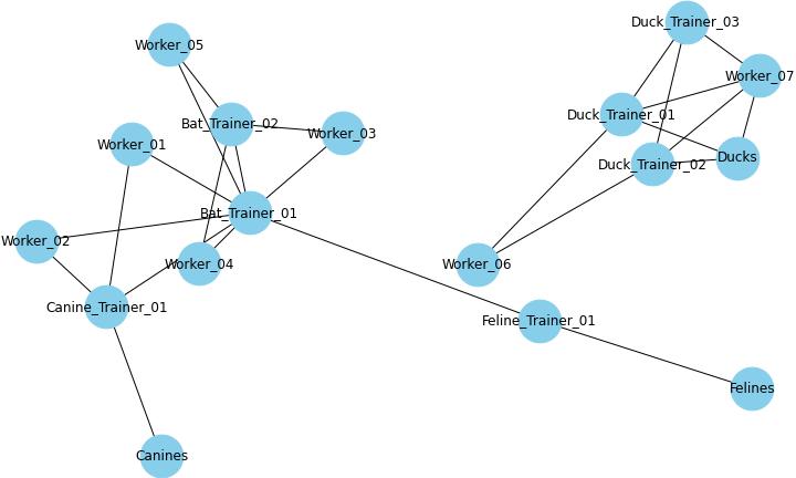
Exposure Map. The exposure map uses information from the case interview to piece together how animals, trainers, and workers might be linked together in the outbreak. Lines indicate that the case was either exposed to or had an interaction with the other cases or animals.
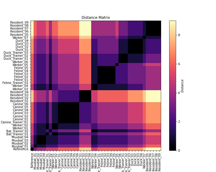
Heatmap. The heatmap shows the pairwise distance between two sequences. The pairwise distance is given by the number of single nucleotide polymorphisms (SNPs), or single base difference between two sequences. The range of SNP differences for the sequenced cases in the outbreak is 0 to 9. A SNP distnace of 0 (darkest color) means that two sequences are identical, while a higher SNP count (lighter color) indicates greater genetic divergence. Comparing this heatmap with the phylogenetic tree helps confirm whether clusters of closely related sequences correspond to expected epidemiological links. Sequences that are darker in color indicate fewer SNP differences between the two sequences, whereas lighter color indicates more SNP differences between the two cases.
21.1 Interpreting the Results
“Let’s take some time to review the results. We should each try to come up with our own interpretations and then compare to see what seems to be best explained by the data.”
The phylogenetic tree revealed patterns in the genetic relationship between the sequences generated from each sample. Some sequences clustered more closely together whereas others showed greated divergence. Meanwhile, the SNP heatmap highlighted key genetic differences, with certain sequences appearing more similar while others displayed increasing variation over time. The team deliberated: what might these patterns suggest about how the virus spread and changed throughout the outbreak?
21.2 Discussion Twelve: Interpreting Phylogenetic Trees
A. Based on the phylogenetic tree, what can you infer about the relationships between the samples? Are there any distinct clusters or outliers?
B. Does the tree structure align with the exposure map? Are the spatial and genomic patterns consistent with one another, or do you notice any discrepancies?
C. When comparing the heatmap (pairwise SNP distances) to the tree, do any clusters or distance patterns reinforce the phylogenetic relationships you observed?
D. Taking all three data sources into account, what conclusions can you draw about transmission dynamics or potential sources? Does this analysis support or challenge your earlier hypothesis?