Statewide COVID-19 Variant Plot
Display COVID-19 variants by specimen collection date
1 How to make the plot
Here’s the code to make the plot. If you want the actual script it will be in the repository under the scripts folder called plots.R
1.1 Libraries
Code
library(pacman)
p_load(
  reticulate,
  fs,
  lubridate,
  dplyr,
  stringr,
  magrittr,
  readr,
  httr,
  readxl,
  ggplot2,
  ggtext,
  ggthemes,
  forcats,
  here
)
# set path
root_path <- here() %>% str_remove("/docs")
1.2 Pull the data
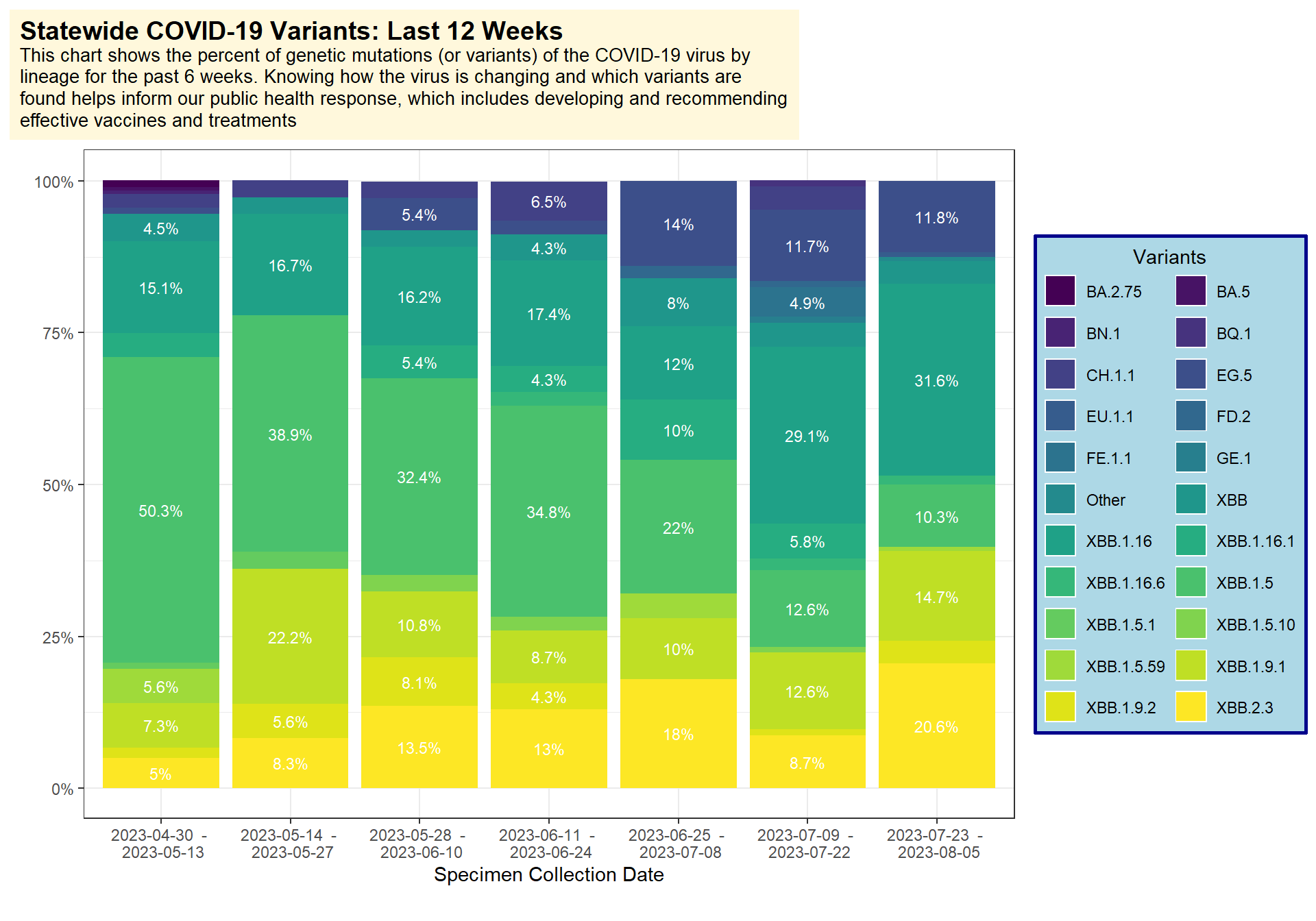
First we can pull the example dataset which is in the repo. This dataset comes directly from the WA DOH COVID-19 dashboard.
- pull the data
- prepare it so we can plot it
- use
dplyr::group_by()to get date range groups for the bars in the plot - we can also adjust some of the labels here so they have
%attached to them
Code
(
  variants <- read_xlsx(file.path(root_path,"data/Downloadable_variant.xlsx")) %>%
    rename(c("start_date" = `Start Date`,
             "end_date" = `End Date`,
             "variant" = `Variant`,
             "seven_day_count" = `7-Day Sequence Count`,
             "seven_day_percent" = `7-Day Percent`,
             "datetime" = `Date/Time Updated`)) %>%
    # make the date ranges for the plot
    # group each date range
    group_by(start_date,end_date) %>%
    # assign each date range an id wtih dplyr::cur_group_id()
    mutate(group_id = cur_group_id()) %>%
    # create labels for the groups
    mutate(group_label = paste(start_date, " - \n", end_date)) %>%
    # add % to the percent labels
    mutate(percent_label = paste0(seven_day_percent,"%")) %>%
    ungroup()
)
1.3 Make the plot
Now we can make the plot. I used:
fill=variantto get the colors stratified by variantgeom_bar()to make the bars andposition="stack"to stack different groups of variants per bar- the
labs()function to adjust how the title looks and add my own html to it. Then I adjusted that title background under thetheme(plot.title())functions - for the legend I used
theme(legend.background())to adjust the colors and background formatting
Code
(
  variants %>%
    ggplot(aes(y=seven_day_percent,
               x=group_label,
               fill=variant,
               label=percent_label)) +
    geom_bar(position="stack", stat="identity") +
    geom_text(
      aes(
        label=ifelse(
          seven_day_percent>4.0,
          percent_label,
          ""
          )
        ),
      size = 3,
      position = position_stack(vjust = 0.5),
      color="white") +
    scale_fill_viridis_d(na.value = "red") +
    # Add percent sign
    scale_y_continuous(labels = function(x) paste0(x, "%")) +
    labs(
         # Without the caption, the dates get cut off in the email..
         caption = "",
         x = "Specimen Collection Date",
         y = "",
         title = "<b><span style = 'font-size:14pt;'>Statewide COVID-19 Variants: Last 12 Weeks</span></b><br>This chart shows the percent of genetic mutations (or variants) of the COVID-19 virus by lineage for the past 6 weeks. Knowing how the virus is changing and which variants are found helps inform our public health response, which includes developing and recommending effective vaccines and treatments") +
    theme_bw() +
    theme(
      # take out the default background
      strip.background  = element_blank(),
      # Adjust where the legend is an put a sick background behind it
      legend.position = 'right',
      legend.background = element_rect(fill = "lightblue",
                                       linetype = "solid",
                                       color = "darkblue",
                                       linewidth = 1),
      legend.direction = "vertical", legend.box = "horizontal",
      plot.title.position = "plot",
      plot.title = element_textbox_simple(
        maxwidth = unit(6,"in"),
        hjust = .0005,
        size = 10,
        padding = margin(5.5, 5.5, 5.5, 5.5),
        margin = margin(0, 0, 5.5, 0),
        fill = "cornsilk"
      )) +
    # Again adjust where the legend should be and how it should be labeled
    guides(fill = guide_legend(title = "Variants",
                               title.position = "top",
                               title.hjust = .5,
                               byrow = TRUE,
                               override.aes = list(size=5.5)),
           size = guide_legend( ))
)